Inann

Sunday, September 17, 2006

Samsung Slimfit

This is the ad that I make for the marketing plan of my group. I think there are many mistakes in this image. I don't spend too much time on it, so the quality is quite bad. However, I think it's good enough for a Work document ...

this is the source:
http://presse.samsung.de/upload/dokumente/20060309_WS32Z409.jpg
Saturday, September 16, 2006

wings

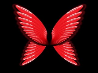
This is my new image, I use some pieces of the previous image to make it. I think it is better in a black background

Saturday, September 09, 2006

New function

This is my new Photoshop image. I create this image following the online tutorial. The main point of this tutorial is using the action function (next to the History) in Photoshop. We have to create a new action, and then we record some actions that we want to reuse later. Finally, we can use the hot key of the new action to repeat it as many times as we want. Some of you may know it already, but it’s new to me and it’s very helpful.

web interface

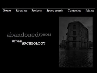
This is my website interface for the assignment 2C. The first image is homepage. I used three colors black, white and grey to create the main theme of the website. I also used red for highlight. I think they are suitable for an architecture website.

Saturday, September 02, 2006

eyes

These are my new images, which I’ve just created few days ago. I apply some filter effects in the original image and its color channels, then I use hue/saturation to change the color of the whole image. I also create one blurry layer on top of the original, and reduce its opacity

Poster


This is my poster for assignment 2b. It is about the littering issue in the society. I just use three basic colors in this poster because I think it’s enough for this image

Sunday, August 27, 2006

Self portrait as a machine

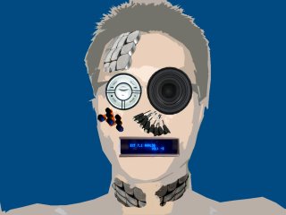
This is my Self portrait as a machine for assignment 2A

Sunday, August 20, 2006

Untitled

I still play around with the Blending option in this new image, especially the texture, gradient overlay and the outer glow.

new image

In this image, I just play around with Photoshop. I try to work with blur effects, and the layer styles. I still using my favorite colours, but I will try to find out some good combinations for other colours.

Saturday, August 12, 2006

text

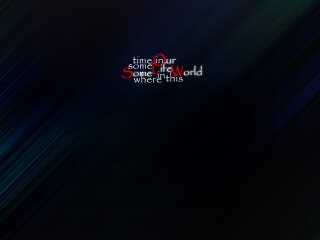
This time, I try to playing with text, especially the arrangement. I write 2 sentences, and then break them out into separate pieces. Next, I arrange them in my new structure and backgrounds; I think it’s quite funny

my faces

These are the images of what I see in my face. I don’t have a good feeling with face every time I see it in the mirror. So I did destroy it with Photoshop in order to make it more different and stranger. I wanted to see it in my side, not my friend’s side.