Inann

Friday, July 28, 2006

Play with layers


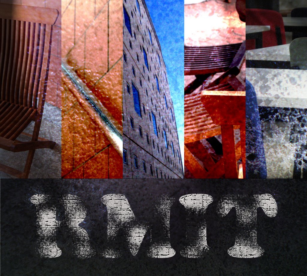
I use the same technique in these three new images. Firstly, I copy the original image into 1 or 2 more layers. Then I apply the blur effects to these layers, it can be Motion blur or Gaussian blur. Finally, I reduce the opacity of these layers. The result is so beautiful, it’s just my opinion. I knew this technique from one of my friends, and I did try it by myself. I think it is good, and it can be used for text also.

Wednesday, July 26, 2006

practise with font


These three images of text are what I did in our last lecture. I think it’s useful to know how to use fonts well. It can help us to express our idea, our main content. However, I think it is quite hard to have a clear understanding about this, for example a font can have its own style and characteristic.

Sunday, July 23, 2006

Bowls

http://beautifulbowls.com/index.php?main_page=index This is a website about bowls; there are many different arts of bowl. I think the bowls are fantastic and colorful with some strange styles. This picture’s name is “Deep Red Ribbon Platters”, a work of Eric Backer. It is an example of art in the platters, and I think the way that they took the picture is good too.


http://beautifulbowls.com/index.php?main_page=index&cPath=5_35

Friday, July 14, 2006

Gestalt

I used the concept closure and continuance of Gestalt in this layout. The dark background may make us feel something mysterious and secret just like the title “The secret sex life of plants”. You can see that the direction of the flowers in the background is from left to right. There are three circles in front also move from left to right, bigger and bigger. Moreover, they also fall from top to bottom same as the title. All of these things may help us to read from left to right, from top down to bottom comfortably.

Thursday, July 13, 2006

Moon and Sun


In this image, the black square is the moon, and the red one is the sun. I think that both sun and moon are almost the same. They have light, they are in the sky, and they just appear haft of a day. They are just different in time and color. That is the reason why I make them similar to each other. I just create 1 part, and then reflect it in order to have the other part; color is the final step.

Tuesday, July 11, 2006

The 2nd try

This is my second time, and I think it’s quite strange and fun; it’s also similar to the cross-shaped solar. When the sun crosses the moon in the sky, they will create a shape like this in the water (this is just my imagination). I use the black background to represent the chaos of the Earth during this time.

Sun & Moon (first try)

This is version 2version 1

and this is the original image
This is my first work of sun & moon symbol, and I like it too. This time, I create 3 versions of the same idea because I think my original maybe not good enough. In the original version, I just draw it in a white background with black strokes. The small circle is the sun (it’s just my opinion to make it strange) and the big one is the moon. As normal, the sun will have some fire around it, and the moon will have some lights. I combine the sun and the moon into one shape in order to make them like a pair. I think they are stronger when they stay together. I just change the color for the other versions to make them looked more attractive

Friday, July 07, 2006

New text-effect

This is a new text effect that I’ve learnt from the tutorial in the internet. The important point in this effect is that we have to use Horizontal Type Mask Tool (T). Moreover, we also have to use the Radial Blur 3 times (I think we can apply more, you can try it), 2 for the text and 1 for the inversion. We also can change the blur center point in the Radial Blur to make our own effects. Here is the link of the tutorial; you may have interest in other effects of this site.
http://www.absolutecross.com/tutorials/photoshop/text/alien-text/

Thursday, July 06, 2006

Play with Text


This time, I try to work with the Layer style, especially the Bevel and Emboss. And the result is really amazing; I think the text is very cool. However, in order to have these styles, I also have to use the Ocean Ripple effect in the filter/distort, the texture option in the Bevel and Emboss, and Gradient overlay in Layer style. All the versions have the same effects; they are just different in some numbers….

Saturday, July 01, 2006

Arrangement & light


Once again, I keep working with the arrangement. However, this time I use many pieces of different pics. All of these pics were taken in my last semester. In this image, I use the lighting effects to make it darker, and also highlight some colours and areas. moreover, this time I try to work with the layers, such as making them overlay or linear light with the background. Therefore, the image looked quite strange and a little bit exciting